Introduction
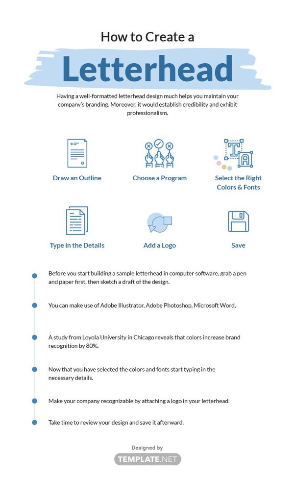
Creating a professional letterhead is essential for any business or organization. It not only adds credibility to your correspondence but also helps in establishing a strong brand identity. However, there are several common mistakes that people often make when designing a letterhead. In this blog post, we will discuss these mistakes and provide valuable tips on how to avoid them.
1. Neglecting the Importance of a Professional Design
One of the most common mistakes when creating a letterhead is neglecting the importance of a professional design. A letterhead represents your brand and serves as a visual representation of your company. It is essential to invest time and effort into creating a design that reflects your brand identity and professionalism.
2. Using Inconsistent Branding Elements
Consistency is key when it comes to branding. Using inconsistent branding elements on your letterhead can confuse your audience and dilute your brand identity. Make sure to use the same fonts, colors, and logo placement as your other marketing materials to maintain a cohesive and recognizable brand image.
3. Overcomplicating the Design
Simplicity is often more effective when it comes to letterhead design. Overcomplicating the design with excessive graphics, multiple fonts, and cluttered layouts can make your letterhead look unprofessional and overwhelming. Keep the design clean, minimalistic, and easy to read.
4. Ignoring the Importance of White Space
White space, also known as negative space, is the empty space between design elements. It plays a crucial role in creating a balanced and visually appealing letterhead. Ignoring the importance of white space can make your letterhead appear crowded and chaotic. Use white space strategically to enhance readability and draw attention to key elements.
5. Using Low-Quality Images

Using low-quality images on your letterhead can significantly impact the overall impression of your brand. Blurry or pixelated images can make your letterhead look unprofessional and cheap. Invest in high-resolution images that are relevant to your brand and ensure they are properly optimized for print or digital use.
6. Neglecting Typography
Typography plays a crucial role in letterhead design. Neglecting typography can result in a letterhead that is difficult to read or lacks visual appeal. Choose fonts that are legible and align with your brand’s personality. Avoid using too many different fonts and ensure proper spacing and alignment for a polished look.
Summary
Designing a letterhead may seem like a simple task, but it requires careful attention to detail. Here is a summary of the common mistakes to avoid:
- Using too many fonts or inappropriate font choices: Stick to one or two fonts that are easy to read and reflect your brand’s personality.
- Overcomplicating the design: Keep the design clean, simple, and professional. Avoid cluttering the letterhead with excessive graphics or unnecessary elements.
- Ignoring the importance of white space: White space helps in creating a balanced and visually appealing letterhead. Don’t overcrowd the design; leave enough space for the content to breathe.
- Forgetting to include essential information: Make sure to include your company’s name, logo, address, contact details, and any other relevant information. Double-check for accuracy.
- Using low-resolution images: To maintain a professional look, always use high-quality images and logos. Blurry or pixelated images can give a negative impression.
- Not considering different paper sizes: Ensure that your letterhead design is adaptable to various paper sizes, including A4, letter, and legal.
By avoiding these common mi important link stakes, you can create a visually appealing and effective letterhead that enhances your brand image and leaves a lasting impression on recipients.
- Q: Should I use too many fonts and colors on my letterhead?
- A: No, it is best to keep your letterhead design simple and professional. Using too many fonts and colors can make it look cluttered and unprofessional.
- Q: Is it necessary to include all my contact information on the letterhead?
- A: Yes, it is important to include your contact information on the letterhead, such as your company name, address, phone number, and email. This makes it easier for recipients to get in touch with you.
- Q: Can I use low-resolution images on my letterhead?
- A: No, it is recommended to use high-resolution images on your letterhead to ensure a crisp and clear appearance. Low-resolution images may appear pixelated and unprofessional.
- Q: Should I include a tagline or slogan on my letterhead?
- A: It is not necessary to include a tagline or slogan on your letterhead, but if it aligns with your brand and adds value to your communication, you can consider including it.
- Q: Is it important to align my letterhead design with my brand identity?
- A: Yes, it is crucial to align your letterhead design with your brand identity. This helps in creating a consistent and recognizable image for your company.
- Q: Can I use a generic template for my letterhead?
- A: While using a generic template may save time, it is recommended to create a custom letterhead design that reflects your brand and stands out from competitors.

Welcome to my website! My name is Joseph McKinnon, and I am a passionate and experienced Print Production Manager. With a deep love for all things print, I have dedicated my career to creating stunning designs for envelopes, letterheads, calendars, and greeting cards.