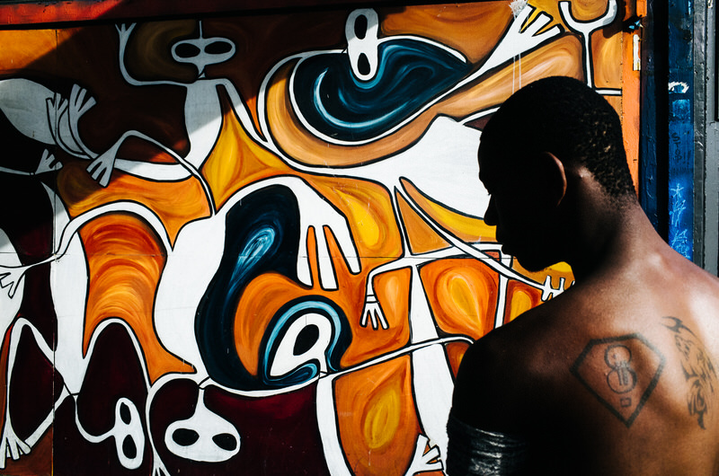
Mastering Color Theory in Mural Design
In order to create a truly stunning mural, you must not only possess artistic skill but also a deep understanding of color theory. The way you choose and combine colors can make or break your design, and mastering this aspect is essential for achieving the desired impact.
But where do you begin? How can you navigate the vast world of color and use it to your advantage? Well, let’s take a closer look at the basics of color theory, the importance of color harmonies, and the techniques you can employ to create depth and evoke emotions through the strategic use of colors.
By the end of this discussion, you’ll have the tools and knowledge needed to take your mural designs to the next level.
The Basics of Color Theory
Understanding the basics of color theory is essential for creating visually appealing and harmonious murals. When it comes to color theory, there are three primary elements to consider: hue, value, and intensity.
Hue refers to the actual color itself, such as red, blue, or green. Value refers to the lightness or darkness of a color, with lighter values being closer to white and darker values closer to black. Intensity, on the other hand, refers to the brightness or dullness of a color. By understanding these three elements, you can effectively manipulate colors to create the desired visual impact in your mural.
Another important aspect of color theory is color harmony. Colors that are harmonious work well together and create a sense of balance in your mural. There are various color schemes that can help you achieve this harmony, such as complementary colors, analogous colors, or monochromatic colors.
Complementary colors are opposite each other on the color wheel and create a high contrast effect. Analogous colors are next to each other on the color wheel and create a more subtle and harmonious effect. Monochromatic colors involve using different shades and tints of a single color, creating a cohesive and unified look.
Understanding Color Harmonies
To create visually balanced and harmonious murals, it’s important to have a solid understanding of different color harmonies. By knowing how colors interact and complement each other, you can create murals that are pleasing to the eye and evoke the desired emotions.
Here are four key color harmonies to consider:
– Complementary Harmony: This harmony is created by pairing colors that are opposite each other on the color wheel, such as red and green or blue and orange. The strong contrast between these colors creates a vibrant and energetic effect.
– Analogous Harmony: Analogous colors are those that are adjacent to each other on the color wheel, such as yellow, orange, and red. This harmony creates a sense of unity and is often used to convey warmth and tranquility.
– Triadic Harmony: Triadic color harmonies involve selecting three colors that are evenly spaced on the color wheel. For example, yellow, blue, and red. This harmony creates a dynamic and balanced composition.
– Monochromatic Harmony: Monochromatic color schemes involve using different shades, tints, and tones of a single color. This harmony is elegant and creates a sense of unity and simplicity.
Choosing the Right Color Palette
Now let’s move on to selecting the perfect color palette for your mural design. Choosing the right colors is crucial as they can greatly impact the overall look and feel of your mural.
One important thing to consider is the mood or atmosphere you want to create. Are you aiming for a vibrant and energetic mural or a calm and soothing one? Understanding color psychology can help you make informed decisions. Warm colors like red, orange, and yellow are associated with energy and excitement, while cool colors like blue, green, and purple evoke a sense of calmness and tranquility.
Another factor to consider is the location and surroundings of your mural. Take into account the existing colors in the space and choose a palette that complements or contrasts with them. If the area already has a lot of bold and bright colors, you might want to opt for a more subdued and neutral palette to create balance. On the other hand, if the space is lacking in color, you can use a vibrant and contrasting palette to make your mural stand out.
Lastly, think about the message or story you want your mural to convey. Consider using colors that symbolize or represent the theme or subject matter of your mural. For example, if you’re painting a mural about nature, using shades of green and earthy tones can help convey the idea of the outdoors.
Creating Depth and Dimension With Colors
Choose your colors strategically to create depth and dimension in your mural design. By carefully selecting and combining colors, you can bring your mural to life and make it visually captivating. Here are some tips to help you achieve depth and dimension in your mural:
– Use warm and cool colors: Incorporating warm colors, such as red, orange, and yellow, in the foreground can make objects appear closer, while cool colors like blue and green can create the illusion of distance in the background.
– Play with light and shadow: By adding shadows and highlights to your mural, you can create the illusion of depth. Use darker shades to create shadows and lighter shades to emphasize areas that catch the light.
– Consider color saturation: Using more saturated colors in the foreground and less saturated colors in the background can create a sense of depth. The more vibrant colors will appear closer, while the less vibrant ones will recede into the distance.
– Use complementary colors: Pairing complementary colors, such as blue and orange or red and green, can create visual interest and depth in your mural. These colors enhance each other when placed next to one another.
Using Color Theory to Evoke Emotions
How can color theory be used to evoke emotions in mural design?
Color has a powerful impact on our emotions and can be effectively used to create specific moods and feelings in mural designs. By understanding the principles of color theory, you can strategically choose colors that will evoke the desired emotional response from viewers.
Warm colors such as red, orange, and yellow tend to evoke feelings of energy, excitement, and happiness. You can use these colors to create a vibrant and lively mural that captures attention and creates a sense of warmth and joy.
On the other hand, cool colors like blue, green, and purple can evoke feelings of calmness, tranquility, and serenity. These colors are perfect for creating a peaceful and soothing atmosphere in your mural design.
Additionally, different shades and tones of colors can also affect emotions. Bright and bold shades can create a sense of intensity and passion, while pastel shades can evoke feelings of softness and delicacy.
Frequently Asked Questions
How Long Does It Typically Take to Master Color Theory in Mural Design?
It typically takes some time to master color theory in mural design. You’ll need to study and practice different color combinations, learn about color harmonies, and understand the psychology of colors.
It’s a process that requires patience and dedication. With consistent effort and practice, you’ll gradually become more confident in your ability to use color effectively in mural design.
Keep experimenting, learning, and refining your skills, and eventually, you’ll become a master of color theory in mural design.
What Are Some Common Mistakes to Avoid When Applying Color Theory in Mural Design?
When applying color theory in mural design, it’s important to avoid some common mistakes.
One mistake is using too many colors, which can make the mural look chaotic.
Another mistake isn’t considering the lighting conditions of the space where the mural will be displayed, as this can affect how the colors appear.
Additionally, not understanding the psychological effects of color on viewers can result in a mural that doesn’t evoke the desired emotions.
Lastly, failing to properly mix and blend colors can result in a mural that looks flat and uninteresting.
Are There Any Specific Color Combinations That Work Best for Outdoor Murals?
When it comes to outdoor murals, there are definitely some color combinations that work better than others. The key is to choose colors that can withstand the environmental conditions and still make an impact.
For example, using contrasting colors like blue and orange or green and purple can create a vibrant and eye-catching mural. It’s also important to consider the surroundings and choose colors that complement the natural landscape or nearby buildings.
Ultimately, the best color combinations for outdoor murals depend on the specific location and desired aesthetic.
Can Color Theory Be Applied to Different Mural Styles, Such as Abstract or Realistic?
Color theory can absolutely be applied to different mural styles, whether they’re abstract or realistic. Understanding color relationships and the emotions they evoke can greatly enhance your mural design, regardless of the style you choose.
Are There Any Recommended Resources or Tools for Further Learning and Practicing Color Theory in Mural Design?
Are there any recommended resources or tools for further learning and practicing color theory in mural design?
Yes, there are several great resources available to help you improve your understanding of color theory in mural design.
Online courses, books, and tutorials can provide valuable information and practical exercises to enhance your skills.
Additionally, software tools like Adobe Color and Color Wheel Pro can assist you in selecting and experimenting with different color combinations for your murals.
Don’t hesitate to explore these resources and practice to master color theory in your mural designs.
Conclusion
So, there you have it! By mastering color theory in mural design, you can create visually stunning and impactful artwork. Understanding the basics of color theory and how different colors harmonize with each other is crucial.
Choosing the right color palette and using it effectively can bring depth and dimension to your mural. Lastly, by why not find out more utilizing color theory, you can evoke specific emotions in your viewers.
So, go ahead and let your creativity soar with the power of color!